
The ISRP is a directorate of the OECD providing expertise in compensation, benefits, pension fund management, payroll administration, actuarial studies, and legal support. It serves international organizations such as NATO, OECD, Council of Europe, ESA, EUMETSAT, ECMWF as well as dozens of others that rely on its recommendations.
When I joined, a CMS build was already underway. The goal was a self-managed system where the ISRP units could publish sensitive documents, manage meetings, and support pensioner services. My role was to help align the needs of the different units, audit the in-progress build, identify quick wins, and refine the information architecture and UX within existing technical constraints.
Marina Berté
2025
Info. Arch.
UX/UI Design
Design System
The project spanned a range of UX and UI challenges, from improving the information architecture to refining editorial workflows and localizing content. Below are the main areas of focus:
Identified key friction points across navigation, missing affordances, features, and CMS workflows in the back office.
Clarified the content hierarchy, restructured the header, and improved navigation while accounting for permission-based visibility across organizations and user types.

Based on audit findings, redesigned core features such as Meetings, Contact Directory, Document Search, Account Settings, and Pension Portal flows, focusing on small but impactful usability improvements.
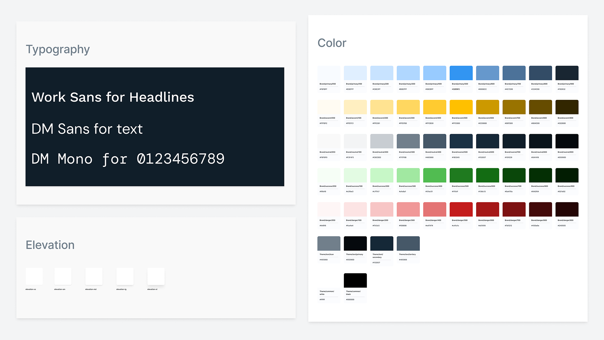
Created a lightweight style guide that informed all React component styling and established the basis for a simple design system.
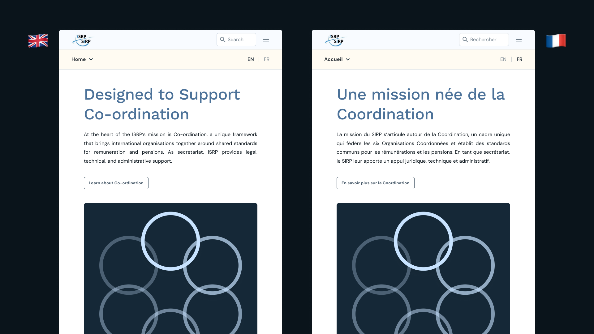
Drafted and uploaded all content and UX copy across two locales in English and French.

Produced visual and content assets aligned with the updated styles where needed.
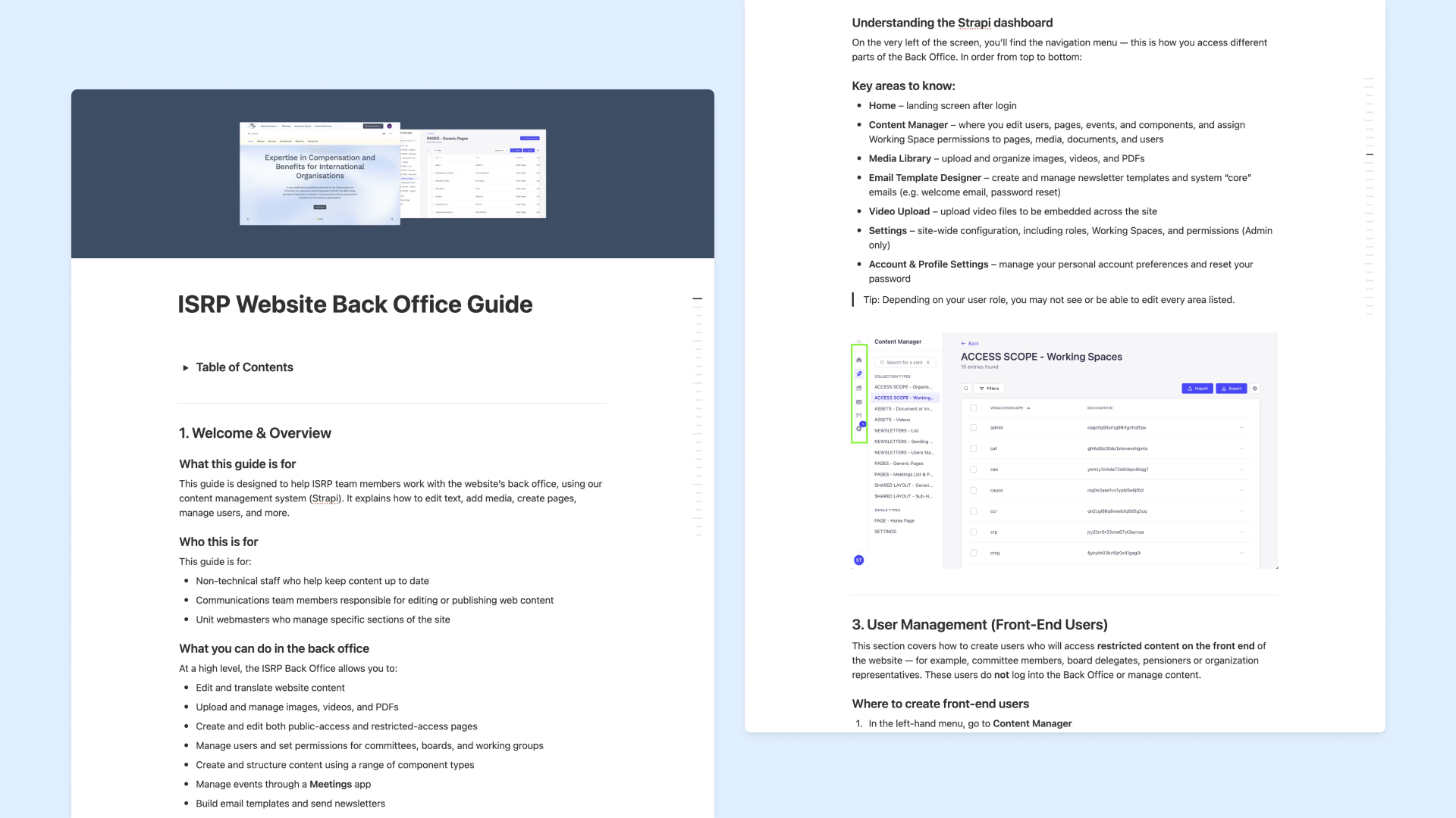
Developed a Back Office User Guide and trained staff to manage the CMS independently.
Understanding the constraints and user needs early on helped focus the audit and prioritize actionable improvements.
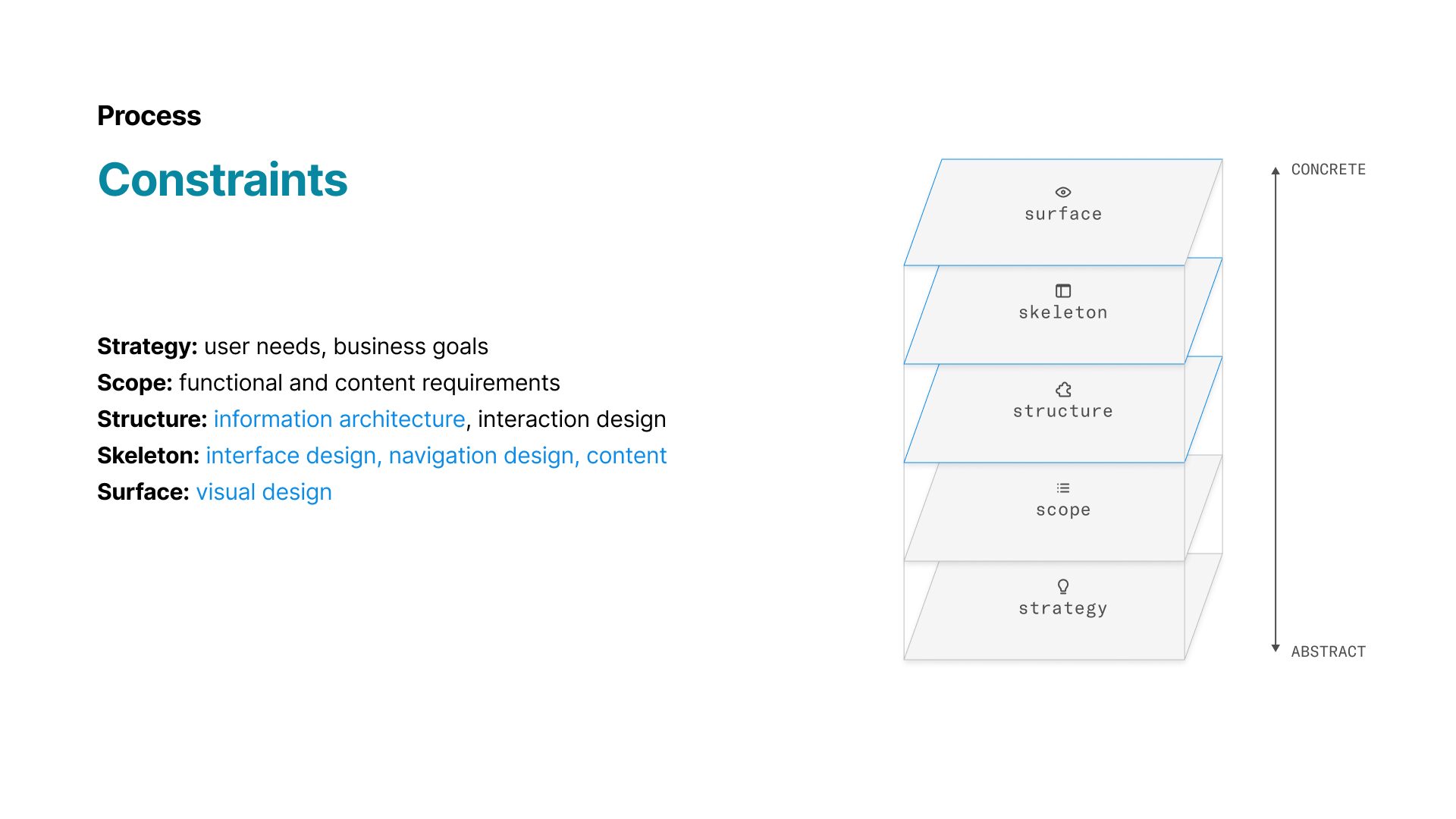
Given the project stage and timeline, revisiting core functional requirements was limited. Most of my impact needed to occur at the Structure, Skeleton, and Surface layers, focusing on information architecture, interface design, visual design, content, and small interaction refinements within the existing CMS build.
The ISRP is accountable first and foremost to the six Co-ordinated Organizations, which follow a shared remuneration and pension scheme. Dozens of Associated Organizations (e.g., CERN, WTO) also work with the ISRP on a case-by-case basis, creating many edge cases and permission scenarios that needed to be reflected in the tooling. Delegates from these organizations visit the site to access reports, sensitive documents, meetings, and contacts.
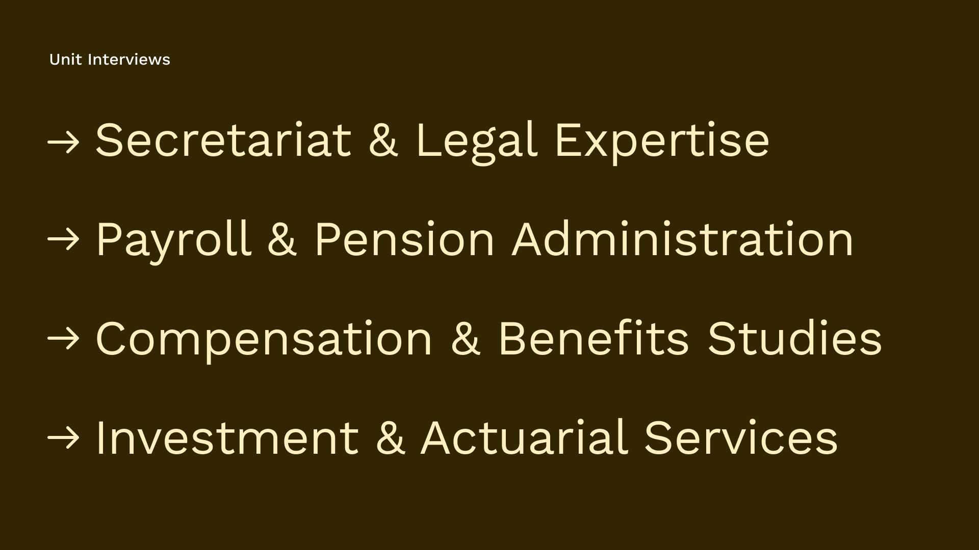
Internally, the ISRP is made up of four units with distinct workflows, and each team has designated editors responsible for managing content in the back office. Interviews with these teams revealed differing expectations around permissions and technical requirements, all of which shaped the focus of the audit.
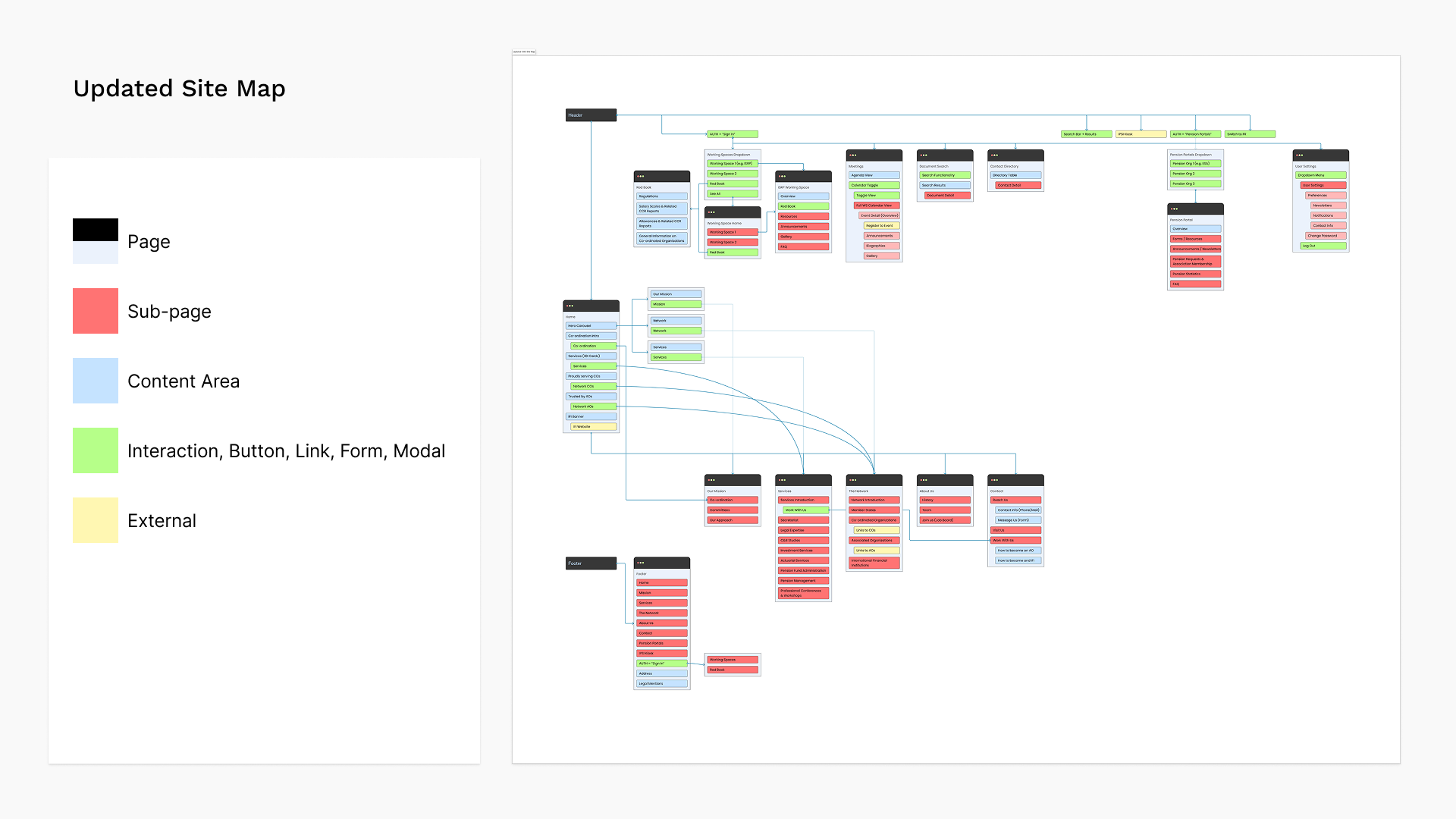
The audit reviewed both the public site and the Strapi back office. It highlighted fragmented navigation, missing affordances in key features, and inconsistent or overly complex CMS workflows. These insights informed a Quick Wins roadmap focused on simplifying navigation, improving interactions, and reducing editor friction within existing technical constraints.
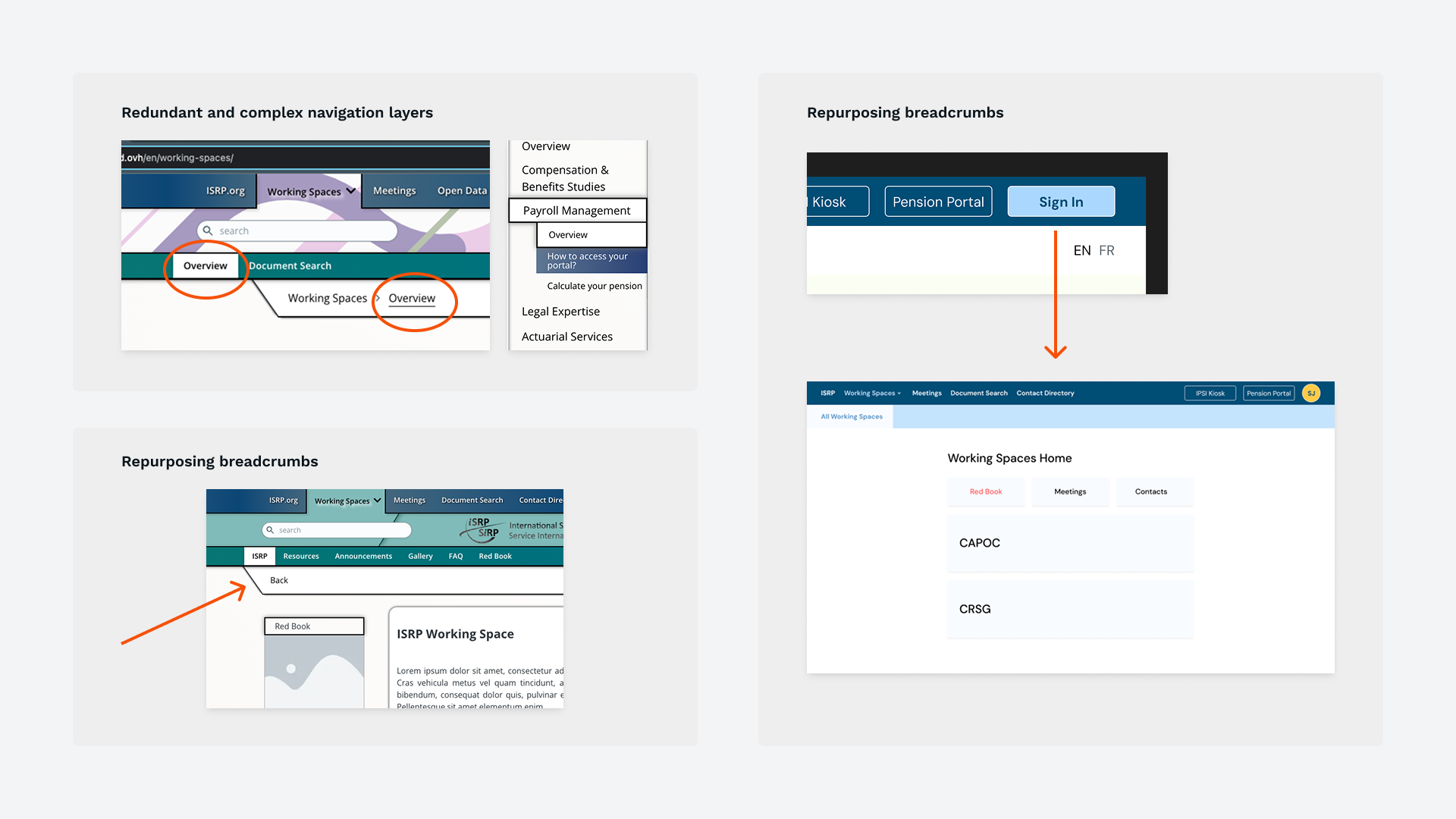
Navigation relied on overlapping menus, redundant breadcrumbs, and deeply nested pages, making core areas like Pension Portals and Working Spaces hard to find. A flatter, more predictable structure was needed to improve orientation, especially for pensioners and first-time users.
Many pages were visually dense and presented too many options at once, making it difficult for users to understand what to do next. Reducing clutter and improving hierarchy were key to speeding up decision-making.
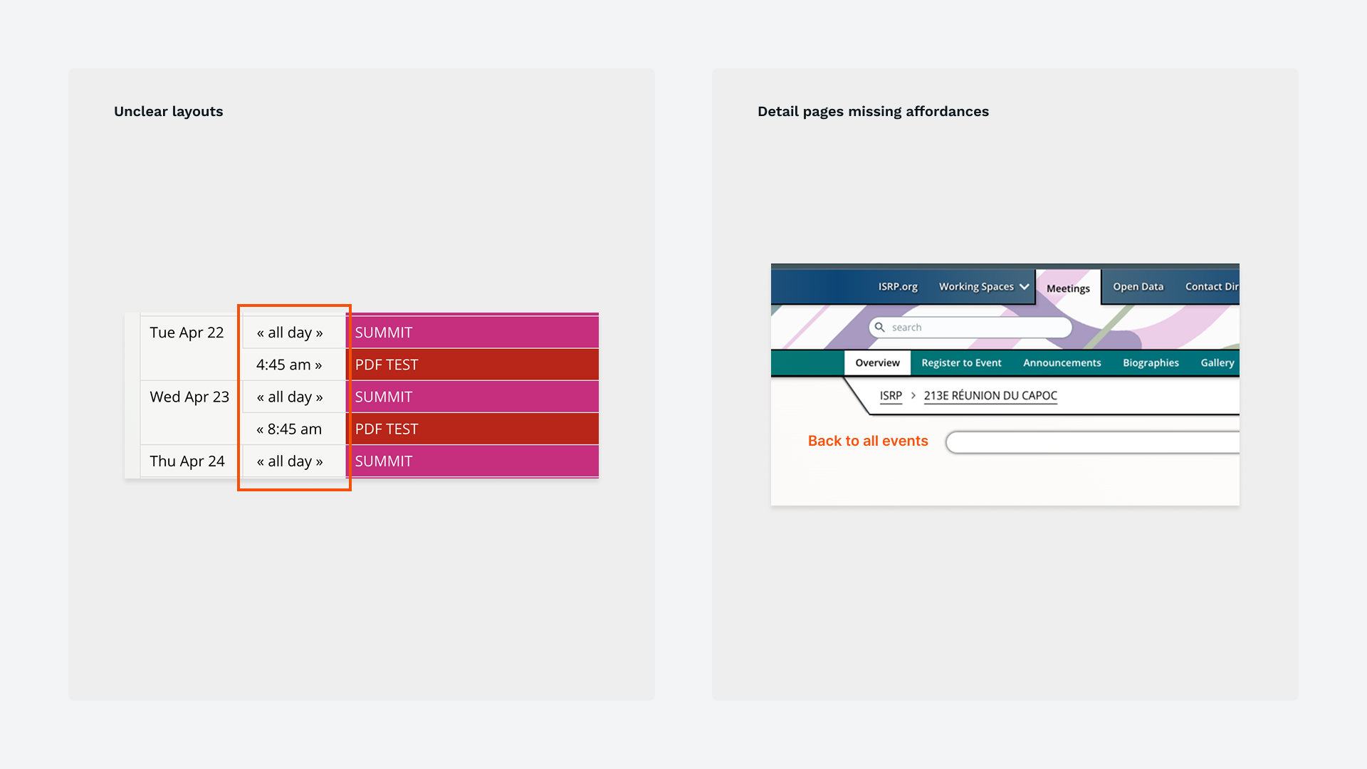
Features such as Meetings, Document Search, Global Search, Contact Directory, and the Pension Portal flow suffered from unclear layouts and multi-step interactions. Each required targeted adjustments to improve clarity and ensure alignment with user expectations.
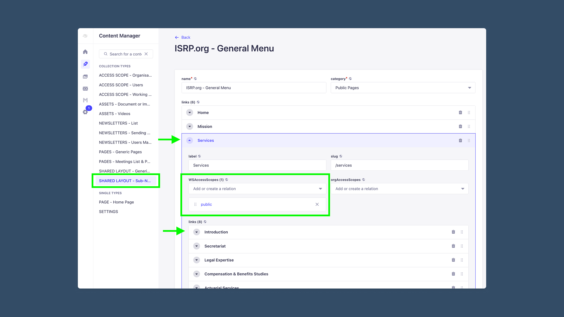
Editors faced bottlenecks like multi-step media uploads, manual linking, dual-locale management, and unclear permission scoping. Streamlining workflows and clarifying naming conventions were essential to reducing errors and dependence on developers.
Inconsistent spacing, typography, and component styles created visual noise and made pages harder to scan. A standardized visual system was needed to improve readability, accessibility, and overall coherence.
Given the limited timeline and a partially built system, I established a few guiding principles to focus our efforts:
Improve the public site first while documenting recommended back-office improvements for future iterations.
Avoid jargon where possible and make labels and actions clear and easy to understand.
Simplify decision-making by limiting options and highlighting the most relevant actions to guide the user.
Leverage known UX/UI patterns and ensure similar elements behave predictably across the site.
Keep interfaces intuitive and similar to the existing site where possible, especially for aging pensioners and users who are less comfortable with technology.
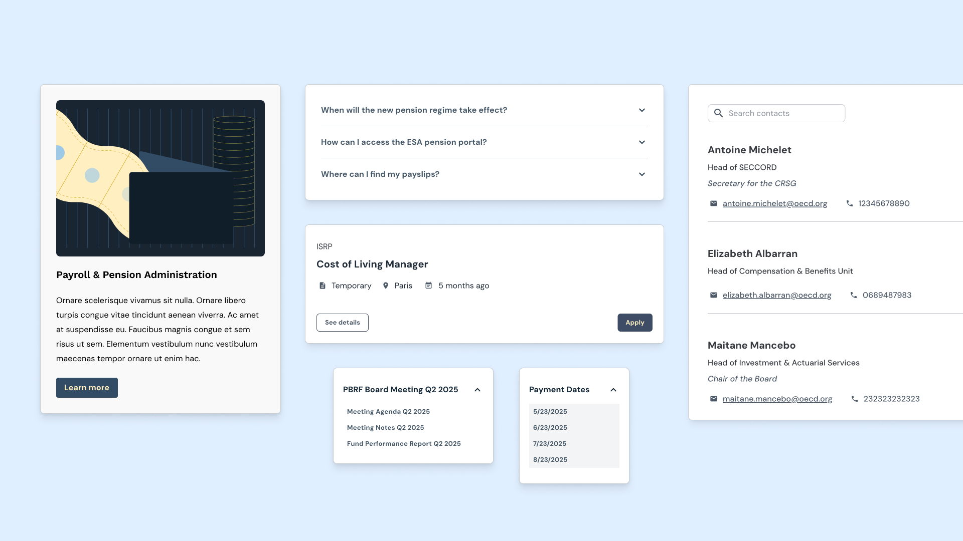
Using a modified Joy UI theme for React as the foundation, I established consistent styles across the site. Spacing, typography, and components such as cards, forms, tabs, dropdowns, FAQs, and galleries, were standardized using shared style tokens, resulting in a cohesive and scalable interface.
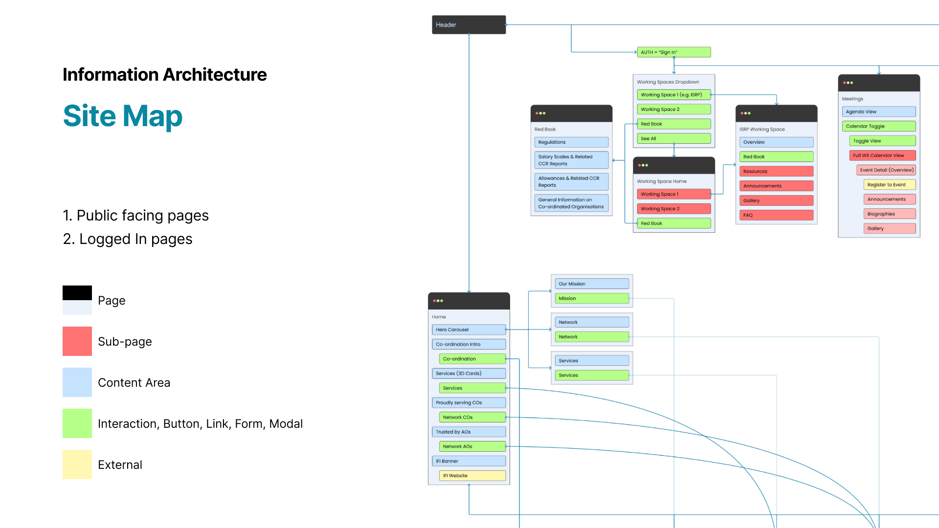
The existing Strapi build offered a great deal of flexibility in how navigation and menu components could be structured, but much of it was overly complex. Navigation needed to clearly support two primary user groups: active staff and delegates who log in to access confidential reports and meetings, and pensioners who rely on IPSI to access private personal information such as payslips.
This guided a process of decluttering the site map, simplifying menu structures, and narrowing the information architecture so that each user group had a clear and predictable path to the areas most relevant to them.
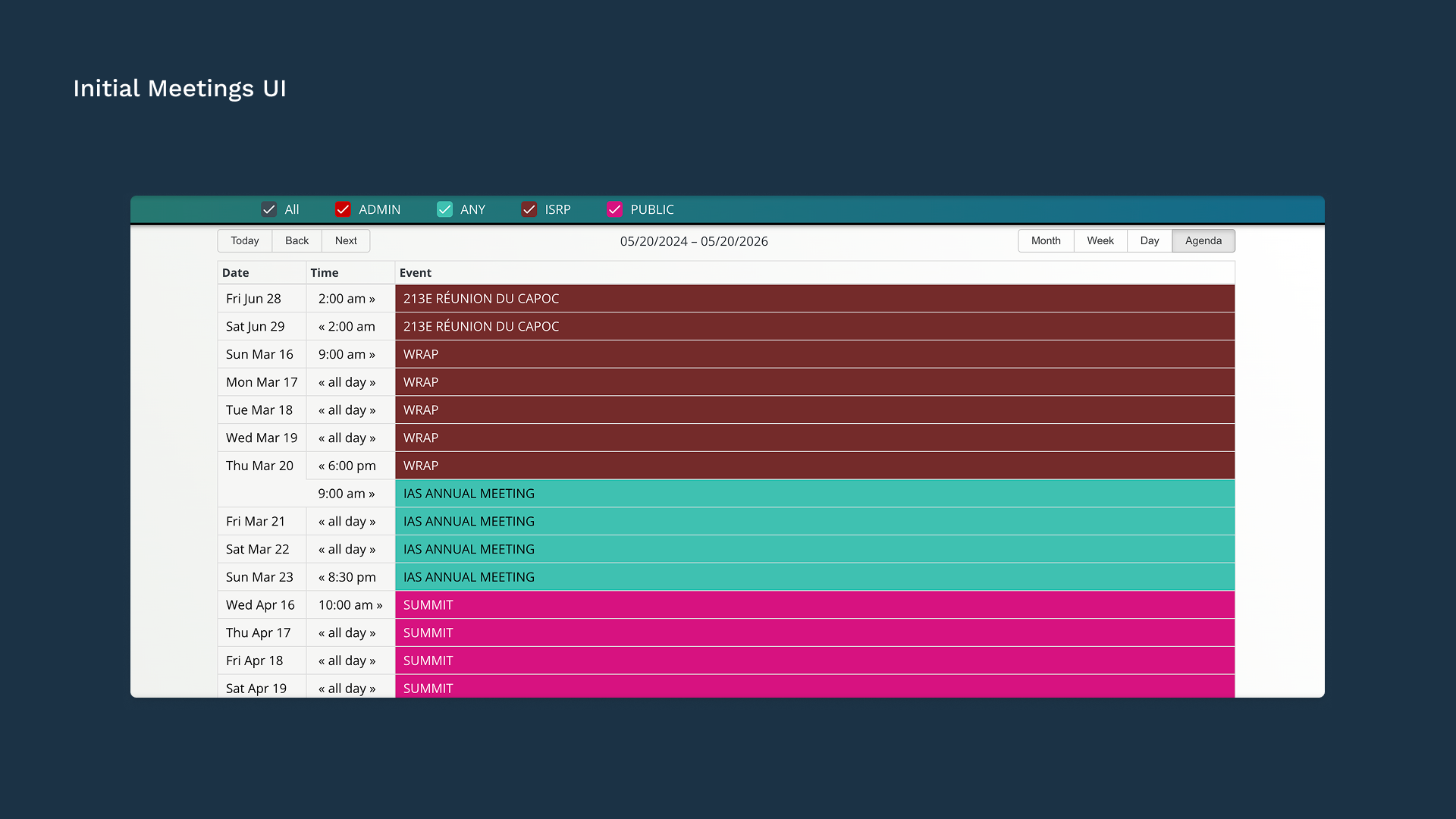
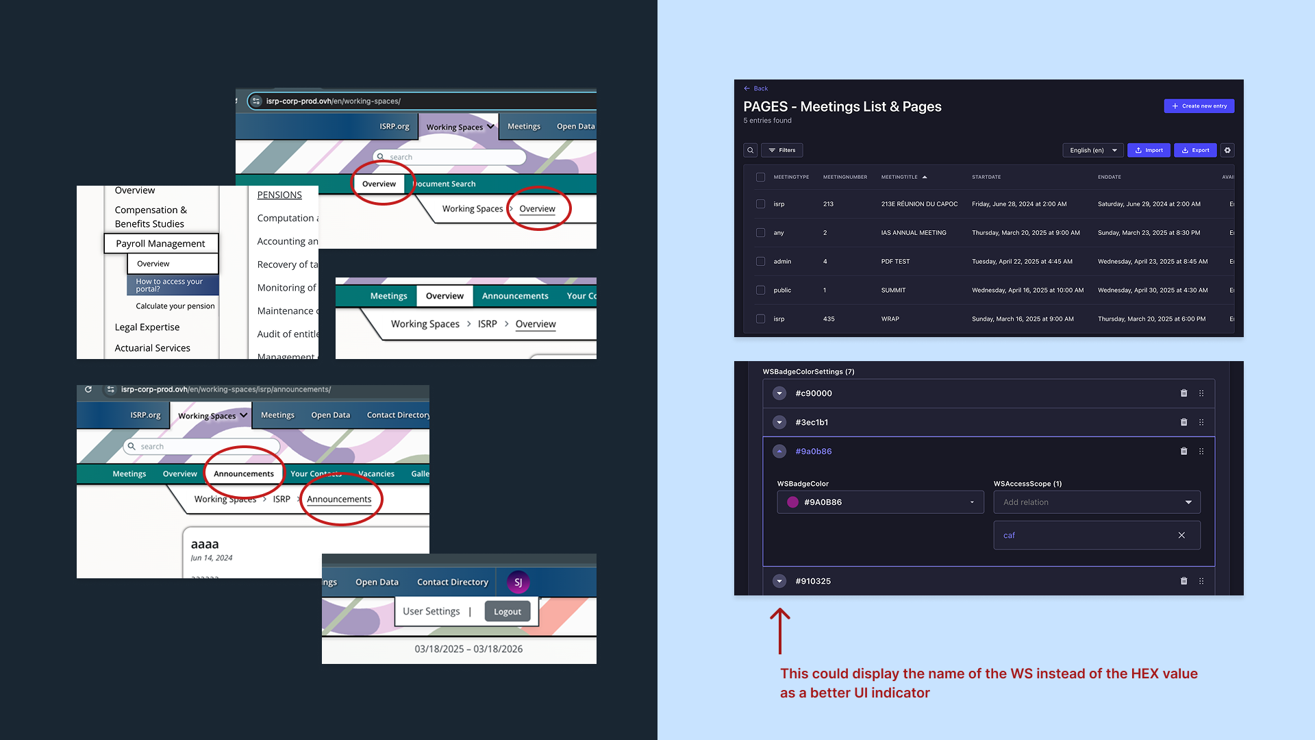
The Meetings layout was reorganized to make meeting dates, documents, and related information easier to scan. Navigation within meetings was simplified as well so delegates could quickly find relevant materials.
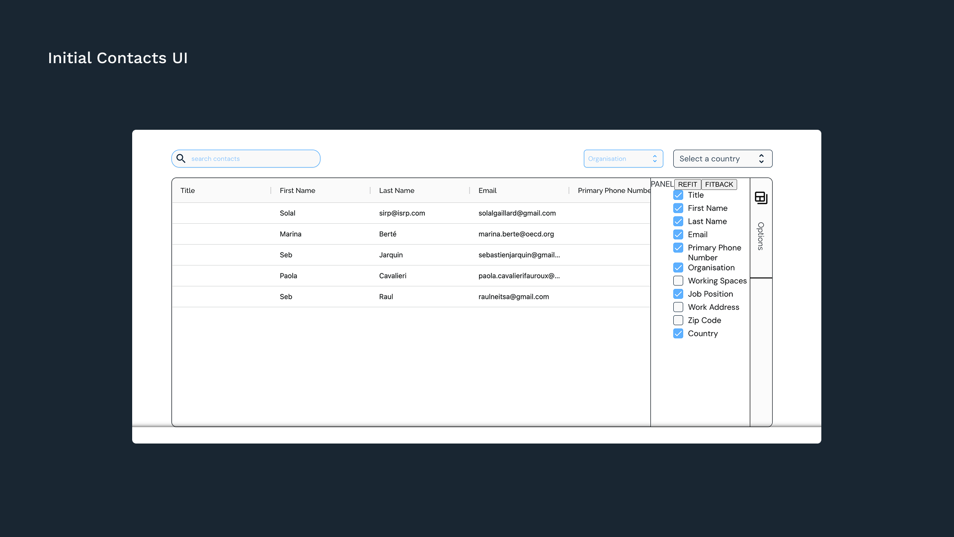
The directory was restructured with a clearer UI and updated layout, making it easier for users to browse personnel data and find specific contacts. The display options drawer was cleaned up, and I introduced both a contact details modal and a new checkbox toolbar to let users toggle between the different directories they have access to.
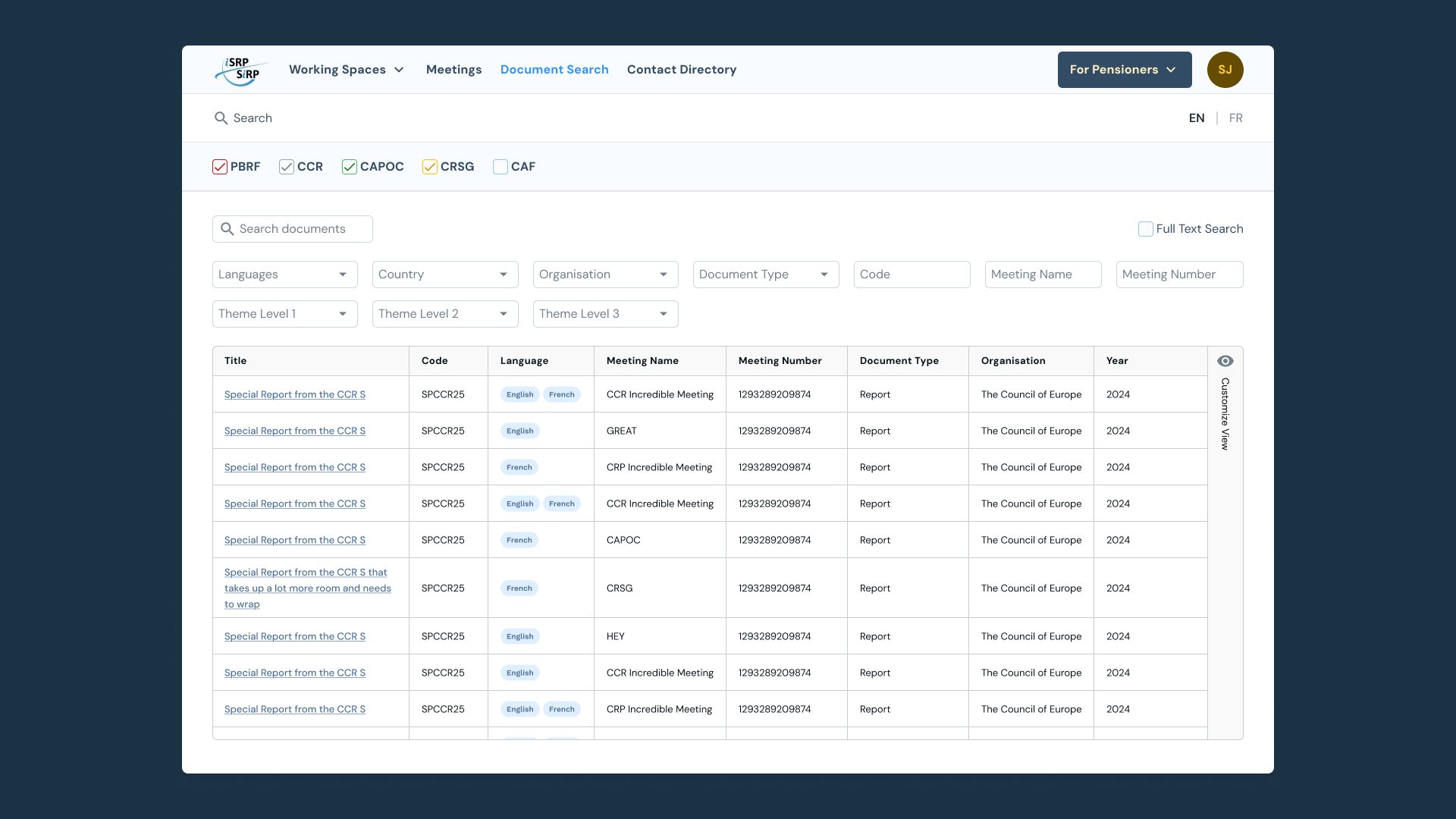
The document search was redesigned to follow the same grid layout and checkbox toolbar as Meetings, creating a consistent experience. Filter dropdowns were added to support advanced searches and to prepare for a broader taxonomy reorganization the internal teams were working on in parallel.
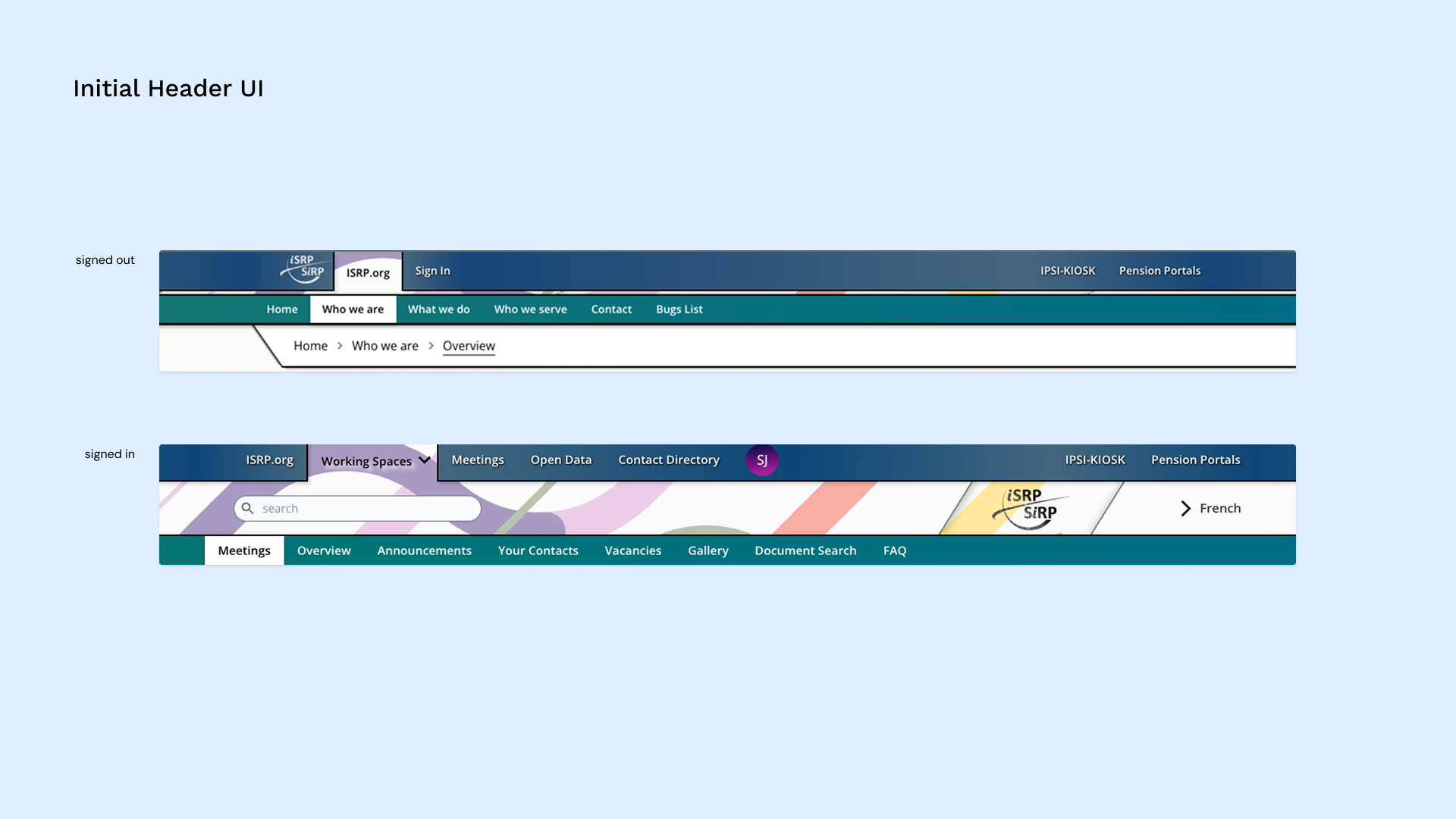
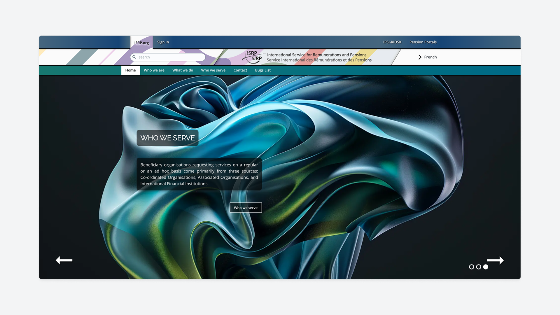
The header was streamlined so every element served a clear purpose. Primary actions were moved to the far right for better visibility, and clear hover and active states were added to each affordance.
The navigation and its sub-components were made fully responsive, and global search was updated to return site-wide results while respecting user permissions
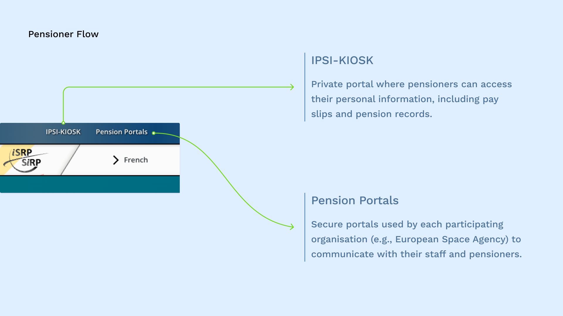
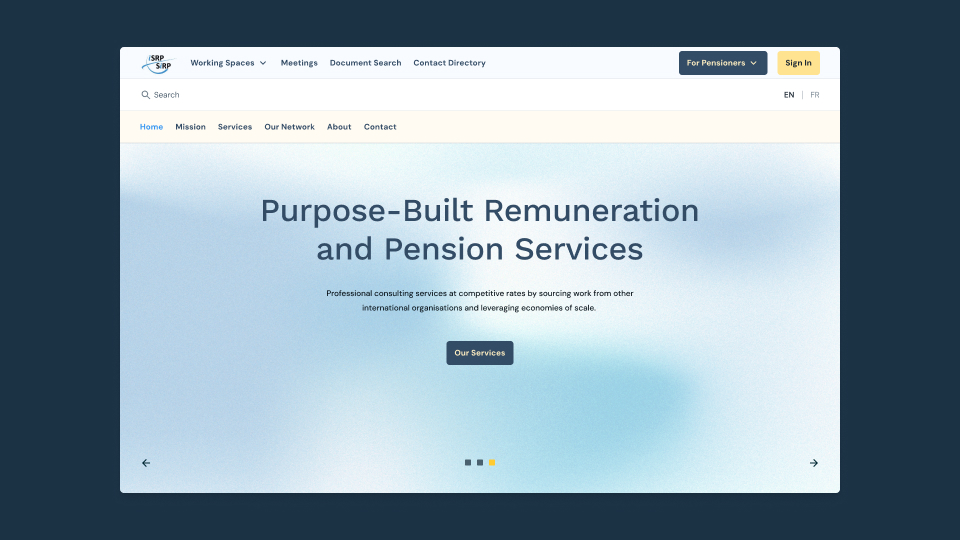
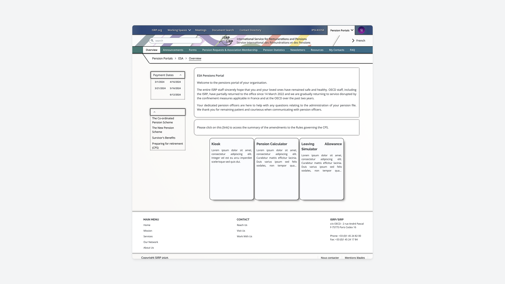
The pensioner experience received dedicated attention, as the ISRP supports over 13,000 pensioners across multiple organizations. A single “For Pensioners” entry point was introduced to orient users as soon as they land on the site, with "My Account" directing them to their private pension data and "Information Portal" providing access to general announcements from their pension organization.
To reduce friction, a quick-access list of recently visited organizations was added, using local cache so pensioners wouldn’t need to re-enter the five-digit access token each time.
Tooltips were also introduced to guide users through the process and make the flow easier to understand.
Joining mid-project meant balancing UX best practices with practical constraints, focusing on improvements that were achievable within the existing build. Creating the back-office guide and training editors were essential steps in helping the ISRP teams manage the system with confidence. At the time of writing, the migration is still underway, but the foundations are in place for a clearer, more maintainable experience for both staff and pensioners.